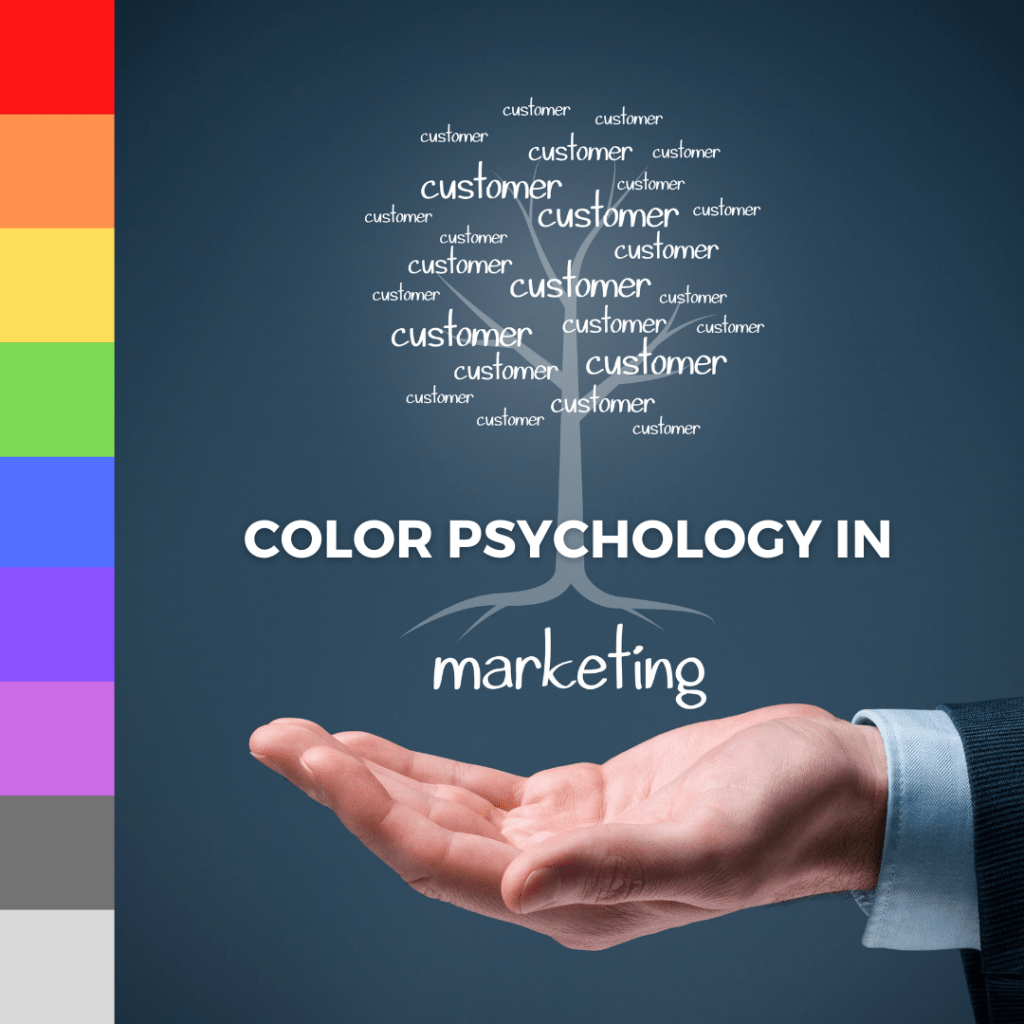
Color has long transcended its role as a mere visual element to become a powerful tool in the realm of marketing. In today’s competitive market, understanding how color influences human behavior is not only an advantage—it’s a necessity. This comprehensive guide delves into the science of color psychology and its strategic application in creative marketing, offering insights, real-world examples, and actionable tips for businesses aiming to boost their brand identity and increase consumer engagement.
In an era where consumers are bombarded with countless messages daily, brands must find ways to stand out. One of the most subtle yet effective methods is the deliberate use of color. The hues chosen for logos, websites, packaging, and advertising campaigns can evoke emotions, shape perceptions, and ultimately drive consumer decisions.
Color psychology is the study of hues as a determinant of human behavior. Marketers leverage this discipline to craft visual identities that resonate with their target audience, creating a memorable experience that encourages trust and loyalty. This article explores the critical role of color in creative marketing, examines its psychological underpinnings, and provides practical guidelines for incorporating color theory into your branding strategy.
Color psychology examines the effects that colors have on human emotions and behaviors. It is rooted in both biology and cultural conditioning. While some responses to color are universal, many are shaped by personal experiences, societal norms, and cultural backgrounds.
The Science Behind Color
Research has shown that color perception is processed in the brain’s visual cortex, triggering emotional and cognitive responses. Studies using neuroimaging techniques have revealed that different colors can activate specific areas in the brain, influencing mood and even physiological reactions. For example:
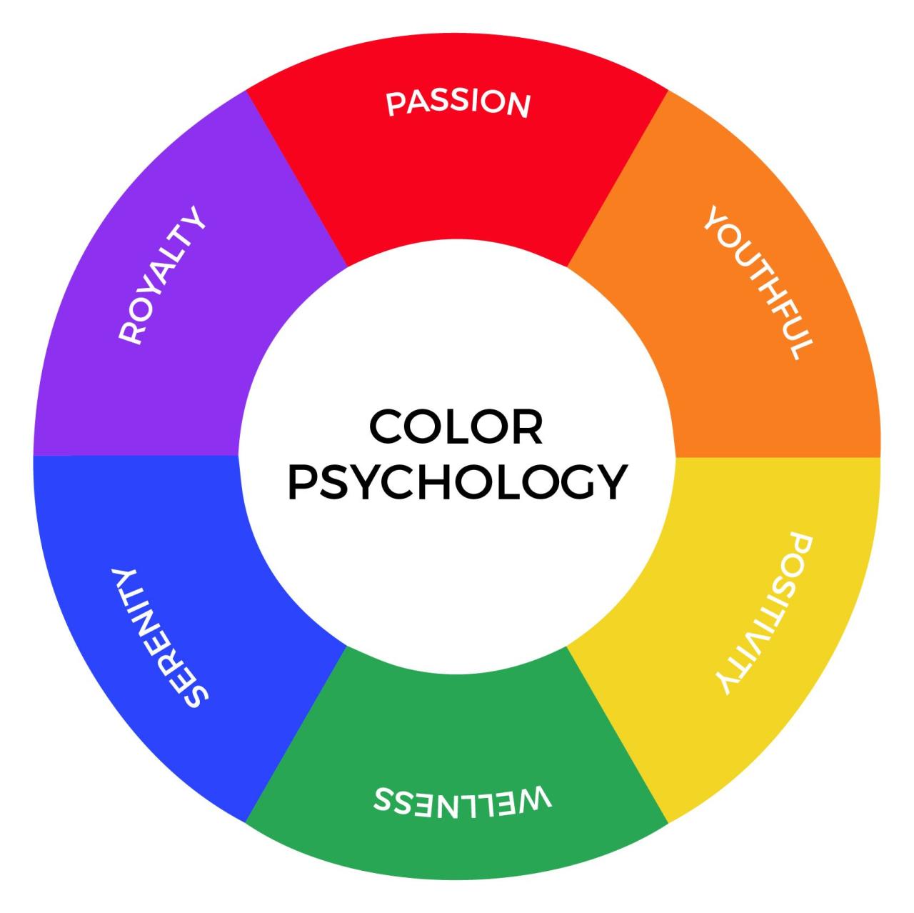
- Red: Often associated with energy, passion, and urgency, red can increase heart rate and stimulate feelings of excitement.
- Blue: Typically linked to calmness, trust, and reliability, blue can help establish a sense of security.
- Yellow: Seen as a color of optimism and creativity, yellow can capture attention and evoke cheerfulness.
- Green: Representing nature, health, and tranquility, green often instills a sense of balance and harmony.
- Purple: Historically associated with luxury and sophistication, purple can convey creativity and elegance.
These responses are not rigid. They are influenced by cultural factors and the context in which colors are used. For example, while red is often seen as a signal for danger or urgency in many Western cultures, it also symbolizes luck and prosperity in countries like China.
The Psychological Impact of Color in Marketing
The ability of color to affect consumer behavior makes it a cornerstone of creative marketing. When utilized correctly, color can:
- Enhance Brand Recognition: A distinctive color palette helps consumers remember and recognize a brand quickly.
- Drive Emotional Connections: Colors evoke emotions that can foster deeper connections with the audience.
- Influence Purchasing Decisions: The right color choices can nudge consumers toward making a purchase.
- Convey Brand Values: Colors communicate the personality and values of a brand at a glance.
Understanding these effects allows marketers to design campaigns that are not only visually appealing but also strategically aligned with their brand message.
The Influence of Colors on Consumer Behavior
Consumer behavior is deeply intertwined with emotion, and color is a powerful medium for eliciting emotional responses. Here, we explore how specific colors can influence decision-making and perception.
Red: The Color of Urgency and Passion
Red is a high-energy color that is known to evoke strong emotions. In marketing, red is often used to grab attention and stimulate a sense of urgency. Retailers frequently use red in clearance sales and limited-time offers to encourage impulse buying.
Psychological Effects of Red:
A. Increases Energy Levels: The stimulating effect of red can encourage quick decision-making.
B. Enhances Appetite: Red is commonly used in the food industry, as it has been shown to stimulate appetite.
C. Signals Importance: Red draws the eye and can emphasize critical information in advertisements.
Blue: Building Trust and Stability
Blue is synonymous with calmness and reliability. Many financial institutions, technology companies, and healthcare providers use blue in their branding to evoke trust and security.
Psychological Effects of Blue:
A. Creates a Sense of Calm: Blue is soothing and can help reduce anxiety in stressful situations.
B. Promotes Loyalty: The reliability associated with blue fosters trust and long-term customer relationships.
C. Communicates Professionalism: Blue is often used to reflect a brand’s commitment to quality and dependability.
Yellow: Capturing Attention with Optimism
Yellow is a vibrant color that radiates positivity and creativity. It is highly effective in capturing attention, making it a favorite for call-to-action buttons and promotional banners.
Psychological Effects of Yellow:
A. Boosts Energy and Optimism: Yellow exudes warmth and can generate feelings of happiness.
B. Enhances Visibility: As one of the most noticeable colors, yellow is ideal for catching the eye in crowded marketplaces.
C. Stimulates Creativity: Yellow encourages a creative mindset, which can be especially beneficial for brands in artistic or innovative industries.
Green: Harmony, Health, and Renewal
Green is deeply connected to nature and conveys messages of growth, health, and renewal. Brands that promote sustainability or wellness often choose green to emphasize their commitment to natural and eco-friendly practices.
Psychological Effects of Green:
A. Instills a Sense of Balance: Green’s association with nature creates a calming and harmonious atmosphere.
B. Signals Sustainability: Green is an ideal choice for brands that want to underscore their environmental responsibility.
C. Promotes Well-being: The color green is linked to health and vitality, making it a popular choice for fitness and wellness products.
Purple: Elegance and Creativity
Purple exudes sophistication and creativity, often used by brands aiming to position themselves as luxurious or innovative. It carries connotations of mystery and uniqueness.
Psychological Effects of Purple:
A. Represents Luxury: Purple is traditionally associated with high quality and exclusivity.
B. Encourages Creativity: The imaginative nature of purple appeals to those looking for creative solutions.
C. Creates a Sense of Mystery: Purple’s rarity in nature gives it an enigmatic quality that can intrigue consumers.
Application in Creative Marketing
Integrating color psychology into creative marketing involves more than selecting a few appealing hues. It requires a deep understanding of your brand, target audience, and the context in which the colors will be used. Here are several strategic approaches:
1. Branding and Visual Identity
Your brand’s visual identity is the cornerstone of how customers perceive you. A well-thought-out color scheme can differentiate your brand in a crowded market.
A. Logo Design:
- Red for Energy: Use red to communicate passion and urgency.
- Blue for Trust: Blue can signal reliability and professionalism.
- Green for Eco-Friendliness: Incorporate green if sustainability is a core value.
B. Website Design:
- Consistent Palette: Maintain a consistent color palette that aligns with your brand message.
- Contrast and Readability: Use contrasting colors to ensure text is legible and calls-to-action are prominent.
C. Packaging:
- Shelf Impact: Choose colors that stand out on the shelf and convey the product’s benefits.
- Emotional Connection: Packaging colors should evoke the desired emotional response, whether it’s excitement, trust, or calmness.
2. Advertising Campaigns
Color can make or break an advertising campaign. A vibrant, well-coordinated color scheme can capture attention and influence how the ad is perceived.
A. Social Media Ads:
- Visual Storytelling: Use color to tell a story and evoke an emotional reaction.
- Call-to-Action Buttons: Select colors that encourage clicks and conversions.
B. Print Media:
- Consistency Across Media: Ensure that the colors used in print align with your digital presence for a unified brand image.
- Cultural Relevance: Tailor color choices to the cultural context of your target audience.
C. Digital Marketing:
- Banner Ads: Bright, contrasting colors can help banner ads stand out.
- Email Marketing: A carefully chosen color palette can improve readability and boost engagement rates.
3. In-Store Experiences
For brick-and-mortar businesses, the colors within the store environment play a crucial role in shaping customer experiences.
A. Interior Design:
- Welcoming Atmosphere: Use warm colors like yellow and orange to create a friendly, inviting environment.
- Luxury Settings: Darker, richer hues like deep blue or purple can evoke sophistication.
B. Product Displays:
- Highlighting Products: Use complementary colors to make products pop and attract attention.
- Customer Flow: Strategic color placement can guide customer movement throughout the store.
C. Promotional Signage:
- Effective Messaging: Use bold, contrasting colors to ensure that signage is noticed and easily read.
- Seasonal Themes: Adapt your color schemes to reflect seasonal trends and promotions.
Successful Branding Examples
Several well-known brands have successfully harnessed the power of color psychology to create lasting impressions.
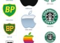
Coca-Cola: The Power of Red
Coca-Cola’s iconic red is more than just a color—it’s a symbol of energy, passion, and celebration. The vibrant hue has become synonymous with the brand, helping it stand out in a crowded market and evoke positive emotions among consumers.
Facebook: Building Trust with Blue
Facebook’s choice of blue underscores its commitment to creating a safe, reliable, and friendly social environment. The color blue instills trust, a critical element for a platform that relies on user engagement and personal data sharing.
Starbucks: Green for Sustainability
Starbucks leverages green not only to reflect its connection with nature but also to emphasize its dedication to sustainability. The calming effect of green complements the brand’s focus on quality, community, and a relaxed coffeehouse experience.
Cadbury: Purple for Premium Quality
Cadbury’s distinctive purple is a strategic choice that conveys luxury and indulgence. The use of purple in its packaging and advertising helps position Cadbury as a premium chocolate brand, appealing to consumers seeking an upscale treat.
Choosing the Right Color Palette for Your Brand
Selecting the perfect color palette involves a mix of art and science. Here are some practical steps and considerations to guide your decision-making process:
Research and Analysis
A. Understand Your Audience:
- Conduct surveys and focus groups to gather insights about your target demographic’s color preferences.
- Analyze competitors to identify common trends and opportunities for differentiation.
B. Define Your Brand Personality:
- Align your color choices with your brand’s core values and personality traits.
- Consider the emotional responses you wish to evoke from your audience.
C. Cultural Considerations:
- Research cultural associations with specific colors, especially if your brand operates internationally.
- Adapt your palette to resonate with different cultural contexts without diluting your brand identity.
Experimentation and Testing
A. A/B Testing:
- Experiment with different color combinations in digital marketing campaigns to gauge consumer reactions.
- Monitor key performance indicators such as click-through rates, conversion rates, and engagement metrics.
B. User Feedback:
- Use surveys and usability tests to gather direct feedback on your color scheme.
- Iterate and refine your palette based on the data collected from your audience.
C. Seasonal Variations:
- Consider adapting your color scheme for seasonal campaigns while maintaining a consistent core identity.
- Use temporary adjustments to gauge how shifts in color impact consumer behavior.
Case Studies in Color-Driven Marketing
Understanding theoretical applications is one thing, but real-world examples demonstrate how color psychology can transform marketing strategies.
Case Study 1: E-Commerce Success with Color Optimization
An online retailer specializing in fashion observed that a minor change in the color of its “Buy Now” button resulted in a significant boost in conversions. The original button, in a neutral gray, was replaced with a vibrant red, aligning with the psychological impact of urgency and excitement. After implementing the change, the company recorded a 25% increase in click-through rates, demonstrating that even subtle adjustments in color can have a profound effect on consumer behavior.
Case Study 2: Rebranding Through a New Color Palette
A well-established beverage company decided to refresh its brand identity to appeal to a younger demographic. The rebranding effort involved a complete overhaul of its color palette—from traditional deep hues to a modern, vibrant mix of colors that conveyed energy and innovation. The updated visual identity not only modernized the brand but also resulted in a 30% increase in social media engagement and a significant boost in overall sales.
Case Study 3: Retail Store Redesign
A physical retail chain embarked on a complete store redesign, focusing on the interior color scheme to enhance customer experience. By integrating warm colors in the entryway and cooler tones in the shopping areas, the store created a welcoming yet sophisticated environment. The result was an increase in average customer dwell time and a notable rise in in-store purchases, highlighting the importance of a well-curated color environment in brick-and-mortar settings.
Practical Tips for Implementing a Color Strategy
To successfully integrate color psychology into your marketing efforts, consider the following best practices:
A. Start with a Clear Brand Identity:
- Define your brand’s core values, target audience, and the emotions you want to evoke.
- Develop a style guide that outlines the primary and secondary colors along with guidelines for their usage.
B. Utilize Professional Design Tools:
- Leverage digital tools such as Adobe Color, Coolors, or Canva’s color palette generator to experiment with different combinations.
- Use these tools to create cohesive palettes that can be applied consistently across various media.
C. Monitor Trends and Adapt:
- Stay updated on design and color trends within your industry.
- Be open to evolving your color strategy as consumer preferences and market dynamics change over time.
D. Integrate Across All Channels:
- Ensure that your color strategy is consistently implemented across digital platforms, print media, packaging, and physical spaces.
- A unified approach reinforces your brand identity and improves overall recognition.
E. Evaluate Performance Regularly:
- Use analytics to measure the impact of color changes on user engagement and conversion rates.
- Be prepared to make adjustments based on data-driven insights to optimize your strategy continuously.

Challenges and Considerations
While color psychology offers substantial benefits, it also presents unique challenges. Understanding the nuances of color perception can be complex, and a one-size-fits-all approach rarely works.
Subjectivity and Cultural Differences
The interpretation of colors can vary widely between individuals and cultures. For instance, while white is associated with purity in some cultures, it may be linked to mourning in others. Marketers must conduct thorough research to ensure that their color choices are appropriate for their intended audience.
Overuse and Saturation
Using too many colors or overly saturated hues can overwhelm consumers and dilute the brand message. It is essential to strike a balance—selecting a primary color palette with complementary accents that enhance rather than overpower the overall design.
Digital Versus Physical Displays
Colors can appear differently on various screens and printed materials. Factors such as lighting, resolution, and printing quality can affect how a color is perceived. Marketers must test their color schemes across multiple mediums to ensure consistency.
Conclusion
Color psychology is a multifaceted discipline that holds immense potential for creative marketing. By understanding the underlying psychological mechanisms, brands can harness the power of color to evoke emotions, drive engagement, and ultimately, boost conversions. Whether you are designing a logo, developing an advertising campaign, or revamping your in-store experience, the thoughtful application of color theory can be the key to differentiating your brand in an increasingly competitive marketplace.
In summary, integrating color psychology into your marketing strategy involves:
A. Understanding the psychological effects of different colors on consumer behavior.
B. Implementing a cohesive visual identity that aligns with your brand values.
C. Testing and iterating based on audience feedback and performance data.
Embrace the art and science of color, and watch as your brand evolves from being just seen to being truly remembered.